Using R to investigate employment trends in North Carolina, 1990-2022
In this portfolio project, we’re going to look into employment trends in the state of North Carolina from 1990 to 2022. Motivated by the dynamic nature of the job market and the critical role employment plays in economic health, this analysis seeks to identify factors influencing employment levels, wage disparities, and seasonal variations across different industries and ownership types. The dataset, sourced from the state’s quarterly and annual employment records, encompasses a wide range of variables. Here are some that we will be looking at more closely:
- Year/Quarter: indicates the year, or quarter within the year, the datapoint is measured
- Industry: the industry sector according to the North American Industry Classification System (NAICS)
- Ownership: breaks down employment by private sector vs. local, state, and federal government
- Average employment
- Average weekly wages
Through a series of statistical tests we’ll explore the underlying trends and differences within the data. Proceed through the collapsible tabs below.
Exploratory plot
It is natural to assume that employment in a given industry can change over time. The rise of the World Wide Web at the turn of the millennium led to a huge increase in activity in the Information sector. We can see that change, and compare it to an industry like Manufacturing over the same period, using a simple scatter plot.
The R script to produce the plot using the ggplot2 library is:
library(ggplot2)
library(dplyr)

data <- read.csv("filepath/data_annual.csv")

data$Year <- as.numeric(as.character(data$Year))

process_industry_data <- function(df, industry_name) {
  df %>%
    filter(Industry == industry_name) %>%
    group_by(Year) %>%
    summarise(Average_Annual_Employment = mean(`Average.Employment`, na.rm = TRUE)) %>%
    mutate(Percent_of_Max = (Average_Annual_Employment / max(Average_Annual_Employment, na.rm = TRUE)),
           Industry = industry_name)
}

information_data <- process_industry_data(data, 'Information')
manufacturing_data <- process_industry_data(data, 'Manufacturing')

combined_data <- bind_rows(information_data, manufacturing_data)

ggplot(combined_data, aes(x = Year, y = Percent_of_Max, color = Industry)) +
  geom_line() +
  geom_point() +
  theme_minimal() +
  scale_y_continuous(labels = scales::percent_format()) +
  labs(title = "Average Annual Employment as Percentage of Industry Maximum",
       subtitle = "Comparing Information vs. Manufacturing Industries in North Carolina",
       x = "Year",
       y = "% of Industry's Maximum Employment")
Here we have a function that takes the annual data and calculates the average employment for a given industry over the course of a year, and makes a column of data for the percentage of the maximum employment over the time period. We then plot the data for the two industries.
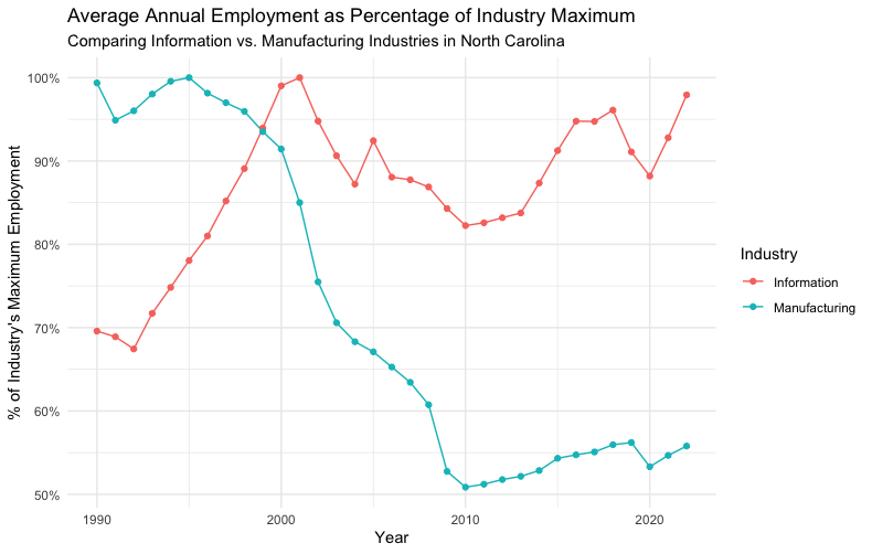
You can clearly see the boom in information jobs over the course of the 1990s, while manufacturing jobs have fallen to about 50% of their 1990 levels.
Average weekly wages for different ownership types
One might expect that, for example, private sector jobs pay more than local government jobs. We can perform a statistical test to check this.
The ANOVA Test: A Primer
To examine the differences in wages among these groups, the Analysis of Variance (ANOVA) test is employed. ANOVA is a statistical method used to compare the means of three or more independent groups to determine if at least one group mean is statistically different from the others. It is particularly well-suited for this analysis for several reasons:
- Multiple Groups: ANOVA is designed to handle comparisons across more than two groups, making it ideal for our investigation into the four types of ownership.
- Homogeneity of Variances: ANOVA assumes that all groups have similar variances, an assumption that fits well with the structured nature of employment sectors where wage policies might introduce some level of uniformity.
- Normality: The test assumes that the data within each group are normally distributed, which is a reasonable assumption for large datasets like employment wages, according to the Central Limit Theorem.
In the context of this study, ANOVA is particularly appropriate for a few key reasons:
- Comparative Analysis: We are interested in comparing the average wages across multiple ownership categories, not just examining the relationship between two variables or comparing two groups.
- Identifying Variance: Beyond identifying differences, ANOVA helps in understanding how much variance in wages can be attributed to the type of ownership, offering insights into the impact of ownership on wage structures.
- Foundation for Further Analysis: Results from ANOVA can lead to more detailed post-hoc analyses, allowing us to pinpoint exactly which ownership types differ from each other, further enriching our understanding.
Our hypotheses for this test are as follows:
- Null Hypothesis (H0): There is no significant difference in the average weekly wages among the different ownership types (Federal Government, State Government, Local Government, and Private). This hypothesis posits that any observed differences in average wages across these groups are due to random chance rather than a systematic effect of ownership type.
- Alternative Hypothesis (H1): There is at least one significant difference in the average weekly wages between the ownership types. This hypothesis suggests that the type of ownership does indeed have an impact on wage levels, and the observed differences in wages are not merely the result of random variation.
Results of the ANOVA test
It is simple to perform the ANOVA test in R:
library(ggplot2)
library(dplyr)

data <- read.csv("filepath/data_quarterly.csv")

data$Ownership <- as.factor(data$Ownership)
data$Average.Weekly.Wage <- as.numeric(data$Average.Weekly.Wage)

data_clean <- filter(data, !is.na(Average.Weekly.Wage))

# ANOVA to test for differences in average weekly wages across different ownership types
anova_result <- aov(Average.Weekly.Wage ~ Ownership, data = data_clean)
summary(anova_result)
The results of the test are as follows.
| Source | Df | Sum Sq | Mean Sq | F value | Pr(>F) |
|---|---|---|---|---|---|
| Ownership | 3 | 6.073e+07 | 20244888 | 119.6 | <2e-16 *** |
| Residuals | 7074 | 1.198e+09 | 169282 |
What do these values mean?
- Df (Degrees of Freedom): Ownership: 3. This represents the number of levels in the ownership variable minus one. Since there are four types of ownership, the degrees of freedom are three, indicating the number of comparisons that can be made. Residuals: 7074. This number represents the degrees of freedom for the error term, calculated as the total number of observations minus the number of levels in the ownership variable.
- Sum Sq (Sum of Squares): Ownership: 6.073e+07. This value indicates the total variation in average weekly wages attributable to differences between the ownership types. Residuals: 1.198e+09. This is the total variation in average weekly wages that is not explained by the ownership types, essentially the error or residual variation.
- Mean Sq (Mean Square): Ownership: 20244888. The mean square for ownership is the sum of squares for ownership divided by its degrees of freedom, measuring the average variation in wages between the different ownership types. Residuals: 169282. The mean square for residuals is the sum of squares for residuals divided by its degrees of freedom, representing the average variation in wages within the ownership groups.
- F value: 119.6. This statistic measures the ratio of the mean square for ownership to the mean square for residuals. An F value of 119.6 significantly exceeds 1, indicating that the variation between group means is substantially greater than the variation within the groups, suggesting that ownership type has a strong effect on wage levels.
- Pr(>F): <2e-16. This p-value is the probability of observing an F value as extreme as, or more extreme than, what was observed if the null hypothesis were true (no difference in means across ownership types). A p-value less than 2e-16 provides strong evidence against the null hypothesis, indicating a statistically significant difference in average weekly wages across the different ownership types.
The ANOVA test results strongly suggest that the type of ownership is a significant factor in determining wage levels, with a very low p-value indicating that the observed differences in mean wages among ownership types are highly unlikely to have occurred by chance. The significant F value reinforces this conclusion, highlighting that the variance between the groups is much larger than the variance within the groups, thus affirming the impact of ownership type on wage disparities. We reject the null hypothesis.
Given these results, further post-hoc analysis, such as Tukey's HSD test, is warranted to identify specifically which ownership types differ in terms of average weekly wages, providing detailed insights into the nature of these disparities.
Tukey's Honest Significant Difference (HSD) Test
Following the ANOVA test, which indicated significant differences in average weekly wages across ownership types, the Tukey's Honest Significant Difference (HSD) test was conducted. This post-hoc analysis is crucial for interpreting ANOVA results more granularly by comparing all possible pairs of groups to identify exactly where the significant differences lie.
Tukey's HSD test is a widely used method for performing multiple pairwise comparisons between group means after a one-way ANOVA has found a significant F-statistic. This test controls the family-wise error rate, thereby maintaining the probability of making one or more Type I errors at a desired level, typically 0.05. The key features of Tukey's HSD test include:
- Pairwise Comparisons: It compares the means of every group with every other group.
- Error Rate Control: Unlike conducting multiple t-tests, Tukey's HSD maintains the overall error rate, making it more reliable for comparing multiple groups.
- Confidence Intervals: For each pairwise comparison, it provides a confidence interval for the difference in means, offering a range of plausible values for the true difference.
After identifying that ownership type influences wage disparities, it becomes essential to pinpoint which types of ownership differ from each other. Tukey's HSD is the appropriate next step because:
- It allows for a comprehensive comparison across all ownership categories.
- It ensures that the risk of false discoveries is controlled when making multiple comparisons.
- It provides actionable insights that can directly inform policy adjustments, wage standardization efforts, or further research into the causes of these disparities.
The results from Tukey's HSD test will typically include:
- Difference in Means: For each pair of groups, the difference in their means along with the direction of the difference.
- Confidence Interval: A 95% confidence interval for the difference in means. If this interval does not include zero, the difference is considered statistically significant.
- Adjusted P-value: The p-value adjusted for the number of comparisons being made. A low p-value (<0.05) indicates a significant difference between the pair of groups.
Interpreting these results allows us to understand not just if but where significant wage disparities exist between different types of ownership. The R script to perform the test is:
if (summary(anova_result)[[1]][["Pr(>F)"]][1] < 0.05) {
  tukey_result <- TukeyHSD(anova_result)
  print(tukey_result)
}
It has the following output.
| Comparison | Difference | Lower Bound | Upper Bound | Adjusted P-value |
|---|---|---|---|---|
| Local Government - Federal Government | -259.70534 | -297.43360 | -221.97707 | 0e+00 |
| Private - Federal Government | -87.20839 | -122.10058 | -52.31619 | 0e+00 |
| State Government - Federal Government | -174.65524 | -214.33931 | -134.97117 | 0e+00 |
| Private - Local Government | 172.49695 | 139.42449 | 205.56941 | 0e+00 |
| State Government - Local Government | 85.05010 | 46.95617 | 123.14403 | 1e-07 |
| State Government - Private | -87.44685 | -122.73412 | -52.15958 | 0e+00 |
Here are the key takeaways:
- Difference: Represents the difference in mean wages between the two groups being compared. A negative value indicates that the first group has a lower average wage than the second group.
- Lower Bound and Upper Bound: These columns provide the 95% confidence interval for the difference in means. If this interval does not include zero, the difference is considered statistically significant, suggesting that the wage disparity between the groups is not due to random chance.
- Adjusted P-value: Reflects the significance of the difference in means after adjusting for the multiple comparisons being made. A value close to 0 indicates a very significant difference between the groups.
The results indicate significant wage disparities between various types of ownership. Specifically, Federal Government employees tend to have higher wages compared to Local Government, Private, and State Government sectors. Additionally, the Private sector shows significantly higher wages than the Local Government, underscoring the influence of ownership type on wage levels.
Plot
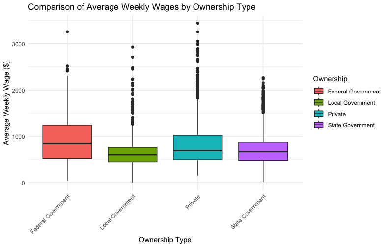
We can generate a box-and-whisker plot for the wages across the ownership types.
ggplot(data_clean, aes(x = Ownership, y = Average.Weekly.Wage, fill = Ownership)) +
  geom_boxplot() +
  theme_minimal() +
  labs(title = "Comparison of Average Weekly Wages by Ownership Type",
       x = "Ownership Type",
       y = "Average Weekly Wage ($)") +
  theme(axis.text.x = element_text(angle = 45, hjust = 1))
The components to the plot are as follows.
- Box: The central box of the plot represents the interquartile range (IQR), which is the range between the first quartile (Q1, 25th percentile) and the third quartile (Q3, 75th percentile). This box contains the middle 50% of the data, providing a visual representation of the data's central tendency and spread.
- Median (Line in the Box): A line across the box indicates the median (the second quartile, Q2) of the dataset. The median represents the midpoint of the data, dividing it into two halves.
- Whiskers: The lines extending from the top and bottom of the box, known as whiskers, show the range of the data outside the middle 50%. The whiskers typically extend to the smallest and largest values within 1.5 times the IQR from the first and third quartiles, respectively. Data points beyond the whiskers are considered outliers.
- Outliers (Dots): Outliers are data points that lie beyond the whiskers. They are represented as dots or small circles. Outliers indicate values that are unusually high or low compared to the rest of the dataset and may warrant further investigation.
Seasonal employment in a specific industry
Following our analysis of wage disparities by ownership type, we shift our focus to examining seasonal variations in employment levels within a given industry. Seasonal variation refers to fluctuations in employment that occur at regular intervals throughout the year, often influenced by climatic changes, holidays, and industry-specific cycles. Understanding these patterns is crucial for businesses, policymakers, and workers alike, as it aids in strategic planning, resource allocation, and workforce management.
Let's look at private ownership for the industry Agriculture, Forestry, Fishing, and Hunting, since it's reasonable to assume outdoors-based jobs might have seasonal fluctuations. We can still perform the ANOVA test here, since we are still looking at variation across multiple groups.
- Null Hypothesis (H0): There is no significant difference in employment levels across the quarters within the selected industry. This hypothesis suggests that any observed changes in employment figures throughout the year are due to chance rather than a systematic seasonal influence.
- Alternative Hypothesis (H1): There is a significant difference in employment levels across the quarters within the selected industry. This posits that seasonal factors systematically affect employment figures, leading to observable and statistically significant fluctuations across different quarters of the year.
library(ggplot2)
library(dplyr)

data <- read.csv("filepath/data_quarterly.csv")

# NAICS Code 11 (Agriculture, Forestry, Fishing, and Hunting)
industry_data <- filter(data, NAICS.Code == 11, Ownership == "Private")

industry_data$Quarter <- as.factor(industry_data$Quarter)

# ANOVA to test for differences in average employment across quarters
anova_result <- aov(Average.Employment ~ Quarter, data = industry_data)
summary(anova_result)

# If significant, perform a post-hoc test to find out which quarters are different
if (summary(anova_result)[[1]][["Pr(>F)"]][1] < 0.05) {
  posthoc_result <- TukeyHSD(anova_result)
  print(posthoc_result)
}
ANOVA test results:
| Source | Df | Sum Sq | Mean Sq | F value | Pr(>F) |
|---|---|---|---|---|---|
| Quarter | 3 | 7.681e+08 | 256021334 | 31.03 | 3.84e-15 *** |
| Residuals | 128 | 1.056e+09 | 8251283 |
Tukey's HSD test results:
| Comparison | Difference | Lower Bound | Upper Bound | Adjusted P-value |
|---|---|---|---|---|
| 2-1 | 4386.5455 | 2545.7308 | 6227.360 | 0.0000000 |
| 3-1 | 6717.2424 | 4876.4278 | 8558.057 | 0.0000000 |
| 4-1 | 3588.2727 | 1747.4581 | 5429.087 | 0.0000079 |
| 3-2 | 2330.6970 | 489.8823 | 4171.512 | 0.0068771 |
| 4-2 | -798.2727 | -2639.0874 | 1042.542 | 0.6724467 |
| 4-3 | -3128.9697 | -4969.7843 | -1288.155 | 0.0001193 |
The ANOVA test demonstrates a significant variation in employment levels across different quarters for the private sector of the industry in focus. With an F value of 31.03 and a p-value of 3.84e-15, the results strongly reject the null hypothesis, indicating that the employment levels significantly differ across quarters. This suggests a pronounced seasonal effect on employment within the industry.
The Tukey HSD test results detail the pairwise comparisons between quarters, highlighting where significant differences in employment levels lie:
- Significant Increases in Employment: Comparisons between the first quarter and the subsequent quarters (2, 3, and 4) all reveal significant increases, with the transition from the first to the third quarter showing the most substantial rise in employment levels.
- Moderate Changes: The shift from the second to the third quarter also marks a statistically significant increase in employment, albeit less pronounced than the changes from the first quarter.
- Stability Between Quarters: The comparison between the second and fourth quarters indicates no significant difference, suggesting a period of employment stability across these quarters.
- Decrease in Employment: A significant decrease in employment is observed from the third to the fourth quarter, highlighting a downturn in seasonal employment as the year progresses.
The conducted analysis underscores a significant seasonal influence on employment within the private sector of the selected industry, with clear patterns of employment fluctuations across the year. These findings are vital for stakeholders within the industry, providing a data-driven basis for anticipating employment needs and effectively planning for seasonal variations. The identified increases and decreases in employment across specific quarters necessitate strategic planning and resource management to accommodate the cyclical nature of the industry's labor demands.
The box-and-whisker plot lets us visualize this variation.
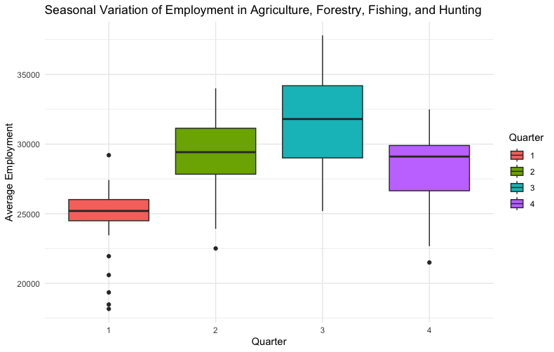
The winter months seem to have lower median employment, but the third quarter shows the highest variation.
Employment in a given industry over time
Not all statistical tests are appropriate for a given dataset. Say we wanted to perform linear regression on the average employment in the Agriculture, Forestry, Fishing, and Hunting industry since 1990.
library(ggplot2)
library(dplyr)

data <- read.csv("filepath/data_annual.csv")

# NAICS Code 11 (Agriculture, Forestry, Fishing and Hunting)
industry_data <- filter(data, NAICS.Code == 11)

# linear regression model
model <- lm(Average.Employment ~ Year, data = industry_data)

summary(model)
Here is the output of the test.
| Residuals: | |
|---|---|
| Min | -6834.6 |
| 1Q | -1435.6 |
| Median | 412.3 |
| 3Q | 1869.8 |
| Max | 4582.1 |
| Coefficients: | |
|---|---|
| Intercept (Estimate) | 57017.78 |
| Intercept (Std. Error) | 99486.80 |
| Intercept (t value) | 0.573 |
| Intercept (Pr(>t)) | 0.571 |
| Year (Estimate) | -14.24 |
| Year (Std. Error) | 49.59 |
| Year (t value) | -0.287 |
| Year (Pr(>t)) | 0.776 |
Residual standard error: 2713
Degrees of freedom: 31
Multiple R-squared: 0.002653
Adjusted R-squared: -0.02952
F-statistic: 0.08247
p-value: 0.7759
How do we interpret these results?
Residuals:
- The range of residuals from -6834.6 to 4582.1 indicates the variability in the data not captured by the model. The median near zero suggests that for many observations, the model's predictions are reasonably close to the actual values.
Coefficients:
- The intercept represents the predicted employment level at the start of the period (if year were zero, which is hypothetical). With an estimate of 57017.78 and a high standard error, the intercept's significance is questionable, as indicated by the p-value of 0.571.
- The coefficient for Year suggests a slight decrease in employment levels over time (-14.24 units per year). However, the statistical insignificance of this coefficient (p-value of 0.776) suggests that time might not be a reliable predictor of employment levels in this industry.
Model Fit:
- The Residual standard error of 2713 on 31 degrees of freedom shows the average difference between the observed employment levels and those predicted by the model.
- A Multiple R-squared value of 0.002653 indicates that the model explains only a tiny fraction of the variance in employment, highlighting its weak predictive power.
- The Adjusted R-squared being negative further emphasizes the poor fit of the model.
- The F-statistic and its corresponding p-value (0.7759) indicate that the model is not statistically significant, suggesting that the year does not have a significant effect on employment levels.
The linear regression analysis reveals no statistically significant relationship between the year and employment levels for the specified industry based on the provided data. The model's inability to significantly explain variations in employment suggests that factors other than time may be influencing employment trends, or that the relationship between time and employment is not linear. This analysis underscores the complexity of employment dynamics and the potential need for exploring additional variables or employing different models to gain a more comprehensive understanding of employment trends over time.
Plotting the results clearly shows the poor fit.
ggplot(industry_data, aes(x = Year, y = Average.Employment)) +
  geom_point() +
  geom_smooth(method = "lm", col = "blue") +
  labs(title = "Trend of Average Employment Over Years in Agriculture, Forestry, Fishing and Hunting",
       x = "Year",
       y = "Average Employment") +
  theme_minimal()
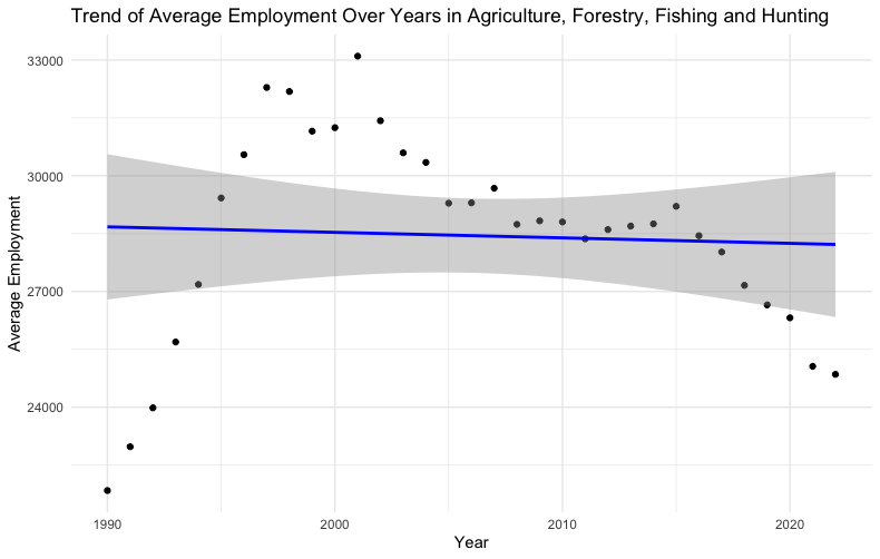
The gray band in the plot represents the confidence interval around the regression line. This confidence interval provides a range of values within which we can be 95% confident that the true regression line lies.
In simpler terms, the gray band shows the uncertainty around the estimated relationship between the independent variable (i.e. year) and the dependent variable (i.e. employment level). The width of the band indicates the level of precision of the estimate, with a narrower band suggesting more precise estimates of the regression line at different values of the independent variable.
The confidence interval accounts for the variability of the data points around the fitted regression line. If the band is wide, it suggests greater uncertainty about the slope of the regression line, meaning the predictive power or the reliability of the model's estimates at those points is lower. Conversely, a narrower band suggests that the estimates of the regression line are more precise, indicating a more reliable model for predicting the dependent variable based on the independent variable.
Conclusion
This analysis of employment data within North Carolina has brought to light significant insights into the state's employment dynamics. Utilizing linear regression and ANOVA tests, coupled with the exploration provided by Tukey's Honest Significant Difference (HSD) test, has revealed patterns and disparities of relevance to understanding the employment landscape.
Key Findings
- Wage Disparities by Ownership: Significant disparities in average weekly wages across different ownership types were confirmed through ANOVA testing, with further elucidation from Tukey's HSD test pinpointing specific pairs of ownership types where these disparities are most pronounced. This underscores the influence of ownership type on wage levels.
- Seasonal Employment Variations: The ANOVA analysis focusing solely on private ownership revealed statistically significant seasonal variations in employment. This highlights the presence of substantial seasonal employment patterns for the Agriculture, Forestry, Fishing, and Hunting industry.
- Trend Analysis Over Time: The lack of statistically significant findings from the linear regression analysis on employment trends over time points to the need for more sophisticated models, or the inclusion of additional variables, to capture the multifaceted nature of employment changes over time.
Final Thoughts
This analysis sheds light on North Carolina's employment landscape, revealing the intricate interplay of factors influencing employment. It highlights the invaluable role of statistical analysis in uncovering underlying trends and disparities, laying a foundation for informed policymaking and strategic initiatives.